The Hidden Power of CRO in a High-CPA World.
Learn why the key to better ROAS isn't just more ads, but a smarter, optimized site that converts visitors at a higher rate.


Unlock Higher Conversions with Strategic Design Insights.
Our approach improves your website with design tweaks and in-depth reports, all while handing over Figma designs for a transparent view of what's going on and why it's awesome for your conversion rates.

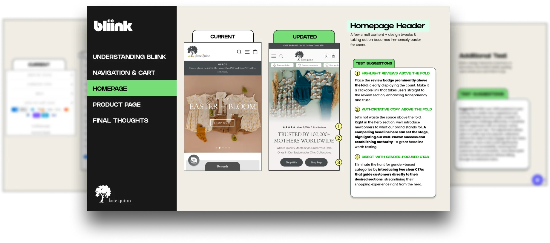

Our approach combines targeted design updates and reporting, enhancing conversions and explaining the changes.

Choose redesign pages, enter your site's URL, and answer a brief questionnare.

We review your website, enhance each part, and integrate essential elements that are missing.

Our team delivers the report and Figma designs for your evaluation.

Gradually apply your Bliink suggestions and conduct tests where appropriate!






Trusted by The World’s Leading Shopify Brands
“The depth of their report, filled with nuanced insights and clear, actionable steps, truly transformed our approach to our website's design and functionality. It felt like they handed us a roadmap to unlocking our site's true potential. A genuine eye-opener!”
Founder

After implementing the strategies from Bliink, we've seen a remarkable uplift in our site's performance. Their expertise in pinpointing exactly what needed to change made all the difference. This wasn't just an audit; it was the key to unlocking our website's potential.
CMO

“The depth of their report, filled with nuanced insights and clear, actionable steps, truly transformed our approach to our website's design and functionality. It felt like they handed us a roadmap to unlocking our site's true potential. A genuine eye-opener!”
Founder

After implementing the strategies from Bliink, we've seen a remarkable uplift in our site's performance. Their expertise in pinpointing exactly what needed to change made all the difference. This wasn't just an audit; it was the key to unlocking our website's potential.
CMO

Detailed reporting with actionable insights and all of the Figma designs to go with it.
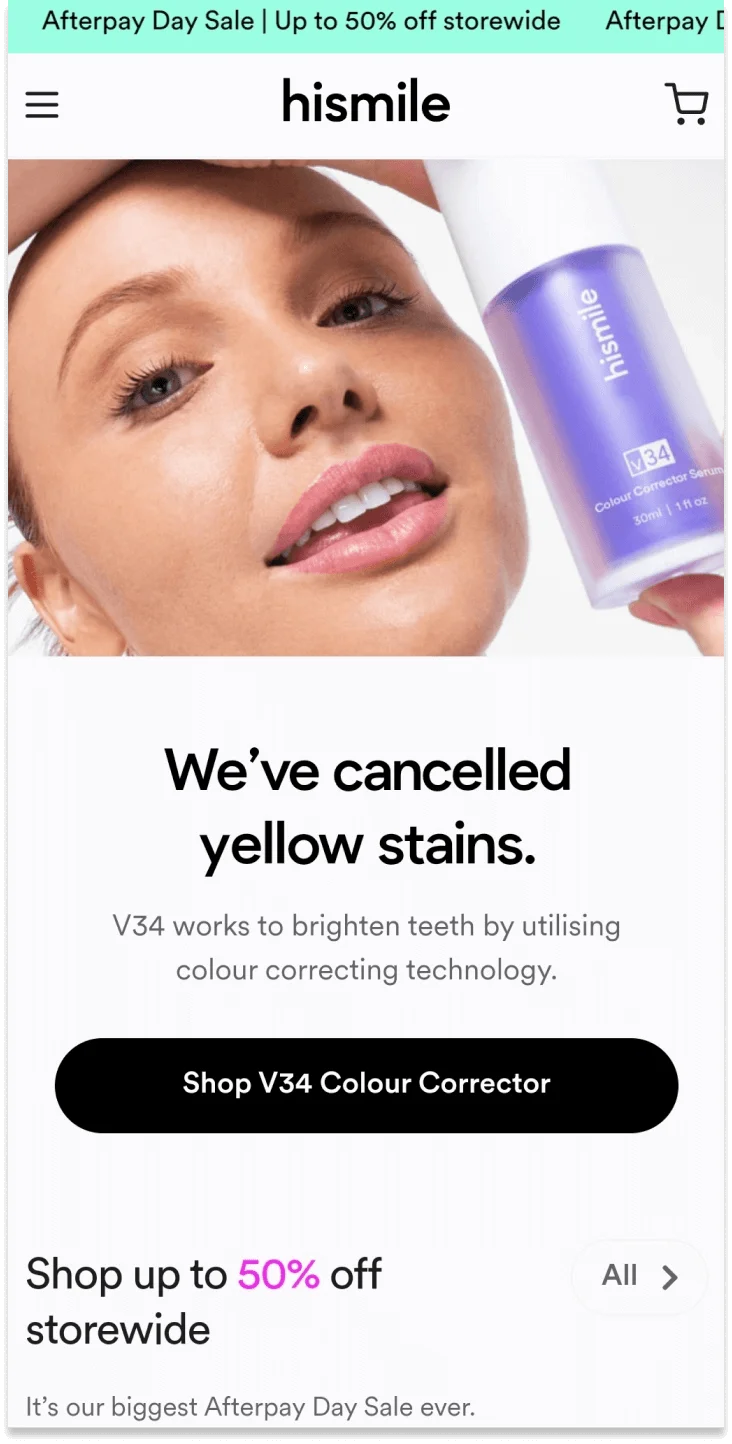
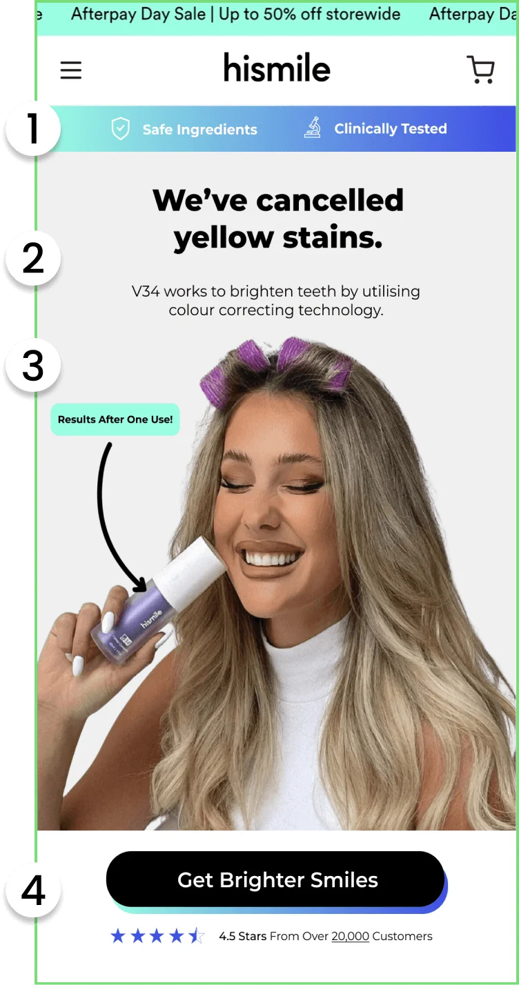
Remove doubts
Reassure users & remove potential conflicts. It's important to call out that the product has been clinically tested and it also includes safe ingredients. After doing some quick research on the V34 stain corrector, I was able to find both of these to be true, so why not add them to the first things users see when they land on your site.
Highlighting Clarity
Improve the font weight to draw attention to the main heading "We've cancelled yellow stains" this will be the first thing most people read and draw attention to whilst also touching on a pain point (stained teeth).
Instant Appeal
Updated the hero image to a more UGC style, rather than a clear model photoshoot. This change helps potential customers better imagine themselves holding and using the product. Additionally, we've highlighted 'Results after one use' with a tag to emphasize the product's quick effectiveness, which can significantly encourage customers to make a purchase from the store.
Instant Appeal
Updated the main CTA to 'Get Brighter Smiles,' reinforcing the promise that customers will achieve a whiter smile after using the product. Also, we've introduced a background color for the button to enhance its visibility and appeal.